Stack Dyno
Reseller PortalFinOps AgentCloud Map

sign in

Back to blog
Jul 5, 2025

Kubernetes cost signals that actually matter

How we separate useful GKE noise from the metrics that map to real savings.

Kubernetes
GKE
Optimization
Kubernetes cost signals that actually matter

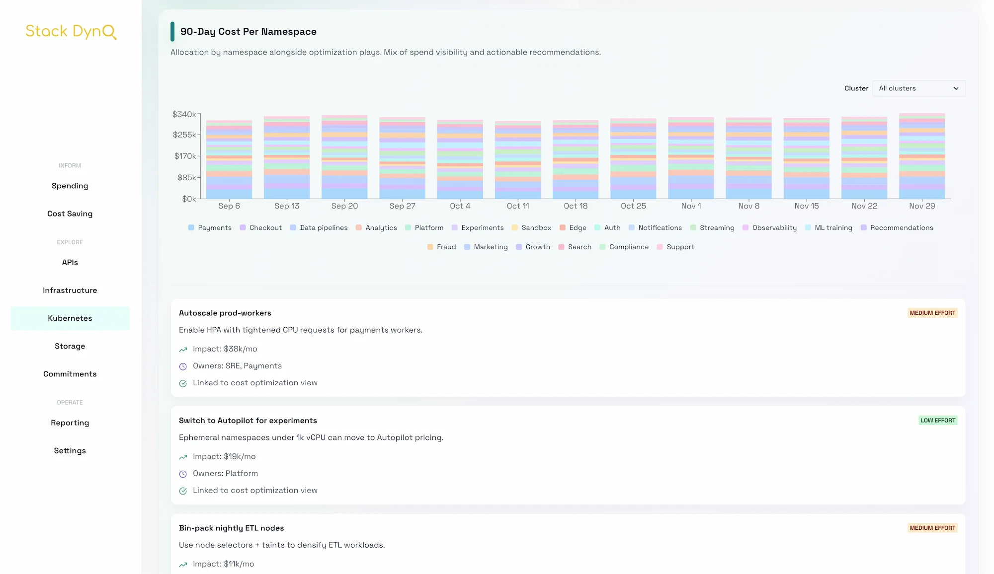
Kubernetes emits a wall of metrics. The trick is to spot the handful that tie to dollars without drowning engineers in graphs.

Start with allocation, not utilization

Before diving in, anchor the list to the outcome customers should feel on the other side.

  • Namespace-level spend over time shows who owns the spike.
  • Requests vs. usage at the workload level surfaces bad defaults.
  • Node pool mix (preemptible vs. on-demand vs. spot-equivalent) drives the floor price.
# Example allocation signal to stream into Stack Dyno
workload:
  namespace: payments
  cpu:
    requested: 6
    used: 2.3
  memory:
    requested: 24Gi
    used: 9.1Gi
  costCenter: finops

Signals to alert on

  1. Request/usage ratio above 2.5x for more than 24 hours.
  2. Nodes running below 50% utilization outside of release windows.
  3. Namespaces without owners or SLA tags in the last 7 days.
  4. Workloads pinned to on-demand when a spot-friendly policy is available.

Move from alerts to automations

Before diving in, set expectations for owners and timing before diving into the details.

  • Offer a one-click plan: reduce requests by 20% for the dev namespace with a rollback toggle.
  • Trigger a Slack thread with the namespace owner and an annotated chart for context.
  • Schedule a weekly "optimizations shipped" email so customers see steady progress.

Stack Dyno bakes these signals into the GKE allocation view. You get clean alerts, a list of owners, and a playbook per namespace, without assembling the puzzle yourself.


Thanks for reading. Share feedback or ask for deeper dives on any topic.

View Stack Dyno